Soorband
Daily wellness, on your wrist.

Turning wearable technology into an understandable and confidence-building purchase experience.
Soorband needed more than a visually polished product page. Prospective customers needed to understand what the wearable measures, how it could support their daily health, whether it would be comfortable to wear, and what they would receive after purchasing it.
I structured the experience around those questions, moving visitors from the product’s everyday benefits to its design, comfort, included accessories, and purchase flow.
Project Information
Role: Product Designer
Responsibilities: Product positioning, website strategy, user experience, interaction design, visual design, responsive design, and prototyping
Timeline: 1-2 months
Team: Solo Project
Status: Live
Overview
SoorBand needed a digital experience that could introduce its wearable, explain its health benefits, and make the product feel desirable without overwhelming visitors with technical information.
I structured the website around the questions a potential customer would naturally have:
What does the product do?
How can it improve my daily life?
Will it be comfortable to wear?
What comes with it?
How can I purchase it?
The Problem
Wearable technology can feel complicated before a customer even begins using it.
Product pages often prioritise sensors, specifications, and technical language without clearly explaining how the device fits into someone’s daily routine.
This can leave potential customers unsure about the product’s value, comfort, and relevance to their personal health goals.
SoorBand needed a website that could translate complex health tracking into a simple and convincing story.
The Solution
I created a product-led commerce experience that introduces the Soor BandX through its everyday benefits.
Rather than presenting every capability at once, the page gradually moves from the product’s core promise to its health categories, comfort, design, accessories, and purchase information.
This gives users enough information to understand the product while maintaining a clear path toward buying it.
Who SoorBand Is For
SoorBand is designed for people who want a clearer understanding of how their daily habits affect their health.
This includes people looking to improve their sleep, understand their recovery, stay active, recognise patterns in their stress levels, or make more informed lifestyle decisions.
The experience is positioned for both health-conscious users and people purchasing their first wearable device.
Key Design Decisions
1. Hero Section:
I placed the Soor BandX at the centre of the opening experience because visitors need to immediately understand what the brand is offering.
The combination of a clear product image, concise value proposition, and direct purchase action helps users recognise the product and decide whether they want to continue exploring.
SoorBand is a health-wearable brand designed to help people better understand their sleep, recovery, movement, stress, and overall well-being through daily health insights.
I designed the website to communicate the value of the Soor BandX, establish it as a premium everyday wearable, and guide prospective customers from initial discovery to purchase.
Project Information
Role: Product Designer
Responsibilities: Product positioning, website strategy, user experience, interaction design, visual design, responsive design, and prototyping
Timeline: 1-2 months
Team: Solo Project
Status: Live
Overview
SoorBand needed a digital experience that could introduce its wearable, explain its health benefits, and make the product feel desirable without overwhelming visitors with technical information.
I structured the website around the questions a potential customer would naturally have:
What does the product do?
How can it improve my daily life?
Will it be comfortable to wear?
What comes with it?
How can I purchase it?
The Problem
Wearable technology can feel complicated before a customer even begins using it.
Product pages often prioritise sensors, specifications, and technical language without clearly explaining how the device fits into someone’s daily routine.
This can leave potential customers unsure about the product’s value, comfort, and relevance to their personal health goals.
SoorBand needed a website that could translate complex health tracking into a simple and convincing story.
The Solution
I created a product-led commerce experience that introduces the Soor BandX through its everyday benefits.
Rather than presenting every capability at once, the page gradually moves from the product’s core promise to its health categories, comfort, design, accessories, and purchase information.
This gives users enough information to understand the product while maintaining a clear path toward buying it.
Who SoorBand Is For
SoorBand is designed for people who want a clearer understanding of how their daily habits affect their health.
This includes people looking to improve their sleep, understand their recovery, stay active, recognise patterns in their stress levels, or make more informed lifestyle decisions.
The experience is positioned for both health-conscious users and people purchasing their first wearable device.
Key Design Decisions
1. Hero Section:
I placed the Soor BandX at the centre of the opening experience because visitors need to immediately understand what the brand is offering.
The combination of a clear product image, concise value proposition, and direct purchase action helps users recognise the product and decide whether they want to continue exploring.

2. Benefits Before Technical Specifications:
I introduced sleep, heart health, movement, and broader wellness benefits before detailed product information because users are more likely to connect with outcomes than sensor terminology.
This helped translate the wearable’s capabilities into familiar goals such as sleeping better, understanding the heart, and improving daily activity.

3. Comfort as Part of the Product Value
I gave comfort and continuous wear their own sections because a health wearable can only provide useful patterns when people are willing to keep wearing it.
Showing the product as lightweight, elegant, and suitable for everyday use helps address concerns about wearing a device throughout the day and while sleeping.


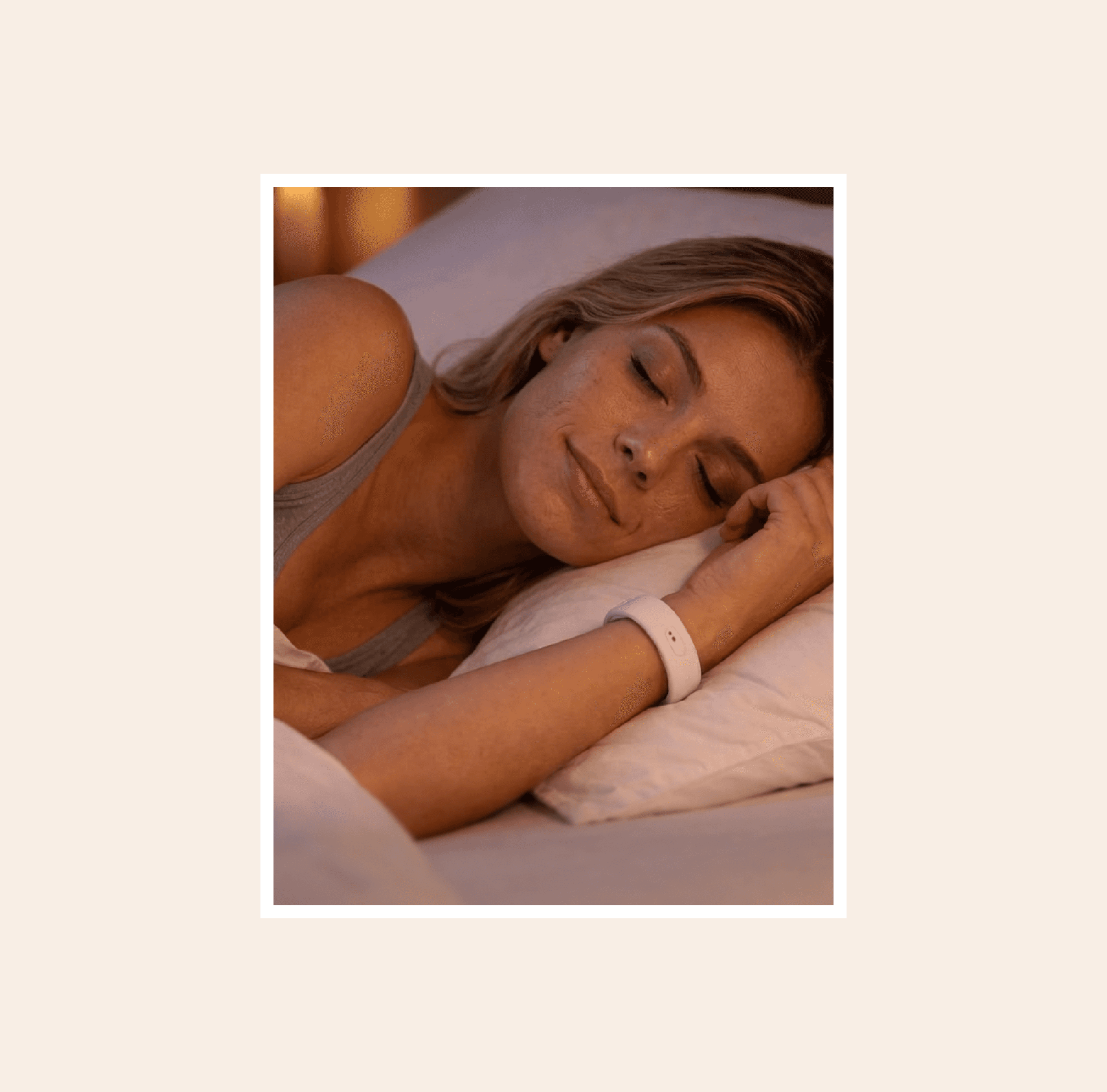
4. Health Technology That Still Feels Desirable
I combined wellness messaging with premium product imagery because the Soor BandX is both a health device and a personal accessory.
This helped the product feel less clinical while still communicating its functional value. The visual direction supports the idea that users should feel comfortable wearing it in different environments.
5. Reducing Purchase Uncertainty
I included a clear “What’s in the box?” section because customers purchasing hardware need to know exactly what they will receive.
Showing the band, charger, and charging cable helps set expectations, answer practical questions, and make the purchase feel more tangible.

6. Purchase Actions Throughout the Journey
I repeated the purchase action at relevant moments instead of relying on a single button at the top of the page.
This allows users to buy after they have seen enough information to feel confident, whether that confidence comes from the health benefits, comfort, product design, or included accessories.

7. A Focused Product Detail Page:
I designed the product detail page to bring the most important purchase information into one focused experience.
Users can review the product, understand its key benefits, see what is included, and access the purchase action without returning to the main landing page. This reduces friction and helps customers make a more confident decision once they are ready to buy.


8. A Quick and Accessible Cart Modal:
I used a cart modal to let users review their selected product without interrupting the shopping experience.
The modal shows the product, quantity, price, and order total while keeping the checkout action clearly visible. This helps users confirm their selection, make adjustments, and continue to checkout without navigating away from the current page.

9. A Clear and Streamlined Checkout:
I designed the checkout experience to keep users focused on completing their purchase without unnecessary distractions.
The layout presents the order summary, customer details, delivery information, and payment actions in a clear sequence. This helps users understand what they are buying, review their information, and complete the transaction with greater confidence.

10. A Footer That Supports Exploration
I designed the footer to give users a clear way to continue exploring the brand after reaching the end of the page.
It brings important links, product information, support resources, and brand details into one organised area. This helps users find what they need without returning to the main navigation and creates a more complete ending to the shopping experience.

Core User Flow
Discover the Product
The user arrives on the website and is introduced to the Soor BandX, its primary health value, and a clear purchase action.
Understand the Benefits
The user explores how the wearable supports sleep, heart health, movement, stress awareness, and general well-being.
Evaluate Daily Use
Product imagery and comfort-focused sections help the user understand how the device looks and how it fits into an everyday routine.
Review the Product
The user sees the product variation, price, included accessories, charger, and cable.
Purchase
Once the user has enough confidence in the product, they can proceed to the shop and complete their purchase.

Explore SoorBand
Discover a more connected view of your everyday health.